Travel information
Ways to get around
WebCAT is our Web-based Connectivity Assessment Toolkit. The toolkit contains two ways of measuring transport connectivity:
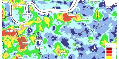
PTALs can be viewed for the whole of London or for individual locations, in both the current (base) and future transport networks.
The TIM tool allows you to plot travel times on the map for any location in London with user-selected attributes including:
You can also view statistics (for example, population, jobs or services) associated with the travel time bands displayed on the map and compare different scenarios.
Our complete guide to connectivity assessment will help WebCAT users become familiar with the techniques we use to assess levels of connectivity in London.
The guide explains how PTAL and TIM are calculated.
Terms used in WebCAT are explained in our WebCAT glossary.
PTAL is a measure of connectivity. A high PTAL in a specific location indicates good connectivity to the public transport network. PTAL values are influenced by the walking distance to nearby stations and stops, and by the frequency of services at these stations and stops.
The TIM feature of WebCAT allows users to produce maps showing:
PTAL and TIM are approximated. They represent the best estimate of connectivity based on the information available to us at the time of calculation. Information about future connectivity is difficult to calculate accurately. Users should consider this uncertainty when using outputs from WebCAT.
If you feel that a WebCAT-calculated PTAL is not representative of your chosen site (for example, it's on the boundary of two cells giving different levels), please ask for a copy of our PTAL spreadsheet macro and guide by sending an email to WebCAT@tfl.gov.uk.
This macro can convert the PTAL calculation text report to a spreadsheet format for you to modify accordingly.
We use the term 'connectivity' to describe the quality of the transport connections between different places in London. We no longer use the term 'accessibility' to do this because it's also used when referring to step-free travel.
WebCAT is not designed to reflect live travel conditions. It provides a consistent baseline for planning processes. Changes to London's transport system will be updated in WebCAT periodically.
TfL's Journey Planner is a more suitable tool for those interested in current point to point journey times. WebCAT is not intended for journey planning.
We will occasionally add new planning scenarios to WebCAT if the information relevant to a new scenario becomes available. If you're interested in a planning scenario which is not currently included in WebCAT, please contact us.
We still use the CAPITAL measure of connectivity, and occasionally ATOS, but they're not available on WebCAT.
See the Connectivity guide above for details about the different measures we use.
See the formal WebCAT terms of use. Users will also need to agree to the Google terms of service.
You can enter an address, postcode or map coordinates (Easting and Northing) in the search line on the top left side of the screen. The map will automatically zoom into the selected location, or present several options if the search may refer to several different places. You can also click on a different location on the map to move to that location.
When a pointing hand icon is shown, you can hold the mouse down and pan across the window to select a new location.
Use the '+' and '-' buttons to zoom in and out to refine your search. To select a location, click the pointer anywhere on the map. This will either generate the PTAL grid layer or a travel time plot depending on the display selected.
Once you have made a selection on the map, you can toggle between the PTAL and TIM using the PTAL and TIM buttons.
You can choose any of the drop-down menus, shown under the map key, to change the data which is displayed. If you make new choices from the drop-down menus, click the 'update' button below these menus in order to update the presentation.
You can zoom in and out, up to a certain limit. The map key will explain the colours used in the map.
Click on the menu icon to display additional mapping layers to give context to PTAL and TIM displays. The additional layers available include the London borough boundaries, London Wards, and 'Output areas' and 'Lower super output areas' from the 2011 census.
Other layers present stations, stops and piers. Opportunity Areas and Areas for Intensification, as defined in the London Plan, can be displayed as well. You can also select Google Maps or Google Aerial Photography as the background mapping.
PTAL and TIM default information refers to the base year. The base year is designed to be representative of the current transport network.
The base years are:
Forecast data is also provided for 2021 and 2031.
The PTAL default display shows base year data for the whole of London. If you chose TIM but have not yet selected a location, a grey scale map is displayed. The default TIM travel time output is for the base year network, using all public transport modes and for the morning peak time period.
TIM outputs can be created from different variables. Choose the most appropriate from the drop down menus below the map key. User-selectable variables include:
TIM outputs can be created based on either travel times from the place you selected, to the place you selected, or the average of the two. From the place you selected is the default.
The default displayed in TIM is up to ten time bands in intervals of 15 minutes.
The 'Change travel time bands' function allows selection of time bands appropriate to the type of analysis being undertaken. The bands available are in 5, 10, 15, 20, 30, or 45 minute intervals.
The number of bands displayed is limited to those required to map travel times for the whole of London. For example, a chosen location using 45 minute intervals may only require 3 or 4 time bands, but using intervals of 5 minutes might result in all ten bands being displayed while still not reaching all areas in London.
Changing travel time bands will alter the map display and catchment bar charts according to the selection made.
This function allows you to display catchment statistics using cumulative bar charts for the location and travel time selection displayed on the map. For example, number of jobs within 15 minutes or 30 minutes.
The bar charts can show:
Population and employment data is provided for the base year (2011 census) as well as the two forecast years 2021 and 2031.
The forecast years are based on GLA forecasts. Population and Employment data outside London is also provided as an estimate for the full catchment area of any location chosen. This is particularly significant for locations on the edge of London.
Please note that our transport network and demographic data outside London is less detailed and less reliable than that inside London.
Catchment statistics can also be generated for current service locations inside London including:
Activate this function by clicking on the menu items to select the bar chart you need. Each bar chart can be saved as a PNG file. For the base year networks you can only display the base year (2011 census) demographic data.
If you choose a future network you can display data for the forecast year and for the base year. This allows the user to see how the catchment of an area changes as a result of changes to the transport network alone or changes in the transport network and demographics over time combined.
This feature allows any one variable to be compared against your current travel time selection. Only one variable can be changed in any comparison query.
For example, the travel times displayed for the default base year transport network could be compared against the future 2021 transport network with all other network characteristics (mode, time of day and direction) remaining the same. When you click on the 'Update' button below the map, the key will change to display the 'Change in Travel Time' between these two variables.
The comparison made is stated on the screen, for example '2021 Forecast Year vs Base Year'. The differences in minutes between the two variables are the values displayed on the map as being faster, slower or no change.
In this case the map would show that the 2021 Forecast Year travel times are 'x' minutes faster or slower than travel times in the base year. To reverse this analysis simply change the variables used by selecting the '2021 Forecast Year' as the initial selection and the 'Base Year' from the 'Compare Travel Times' menu item as the comparator. The updated map would then show base year travel times are 'x' minutes faster or slower than travel times for the 2021 forecast year.
The map window displays faster travel times in shades of blue while slower travel time are displayed in shades of purple. No change is displayed in grey.
When the 'Compare travel times' item has been selected and updated, the resulting catchment bar charts will reflect the map with the bars split into the same intervals: faster, slower or no change in travel time.
The same catchment statistics are available as those listed in the 'Catchment analysis for your selected location' section above.
These bar charts do not display cumulative values but rather the number of people that are affected within each interval displayed on the map.
For example, if the map compares travel times for the '2021 Forecast Year vs Base Year' and the user has selected total population from the catchment datasets, the bar chart will show how many people for the chosen location lie within each of the travel time bands displayed.
WebCAT will be regularly updated with new features. Keep up with the latest developments on the WebCAT updates page.