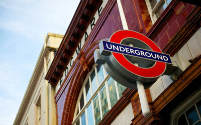
Our roundel

1908
The very first roundel starts life as a platform nameboard at the station we now call St James's Park. Originally known as the bar and circle, the red, glassy, enamel disc with the blue horizontal bar is created to make station names stand out against the adverts and billboards on platform walls.
1911/1912
The new logo begins to appear on map covers, station exteriors, posters and other publicity. There aren't any guidelines at this point so artists use the bar and circle freely and imaginatively in their work.
The letters U and D also begin to appear across the bar of the roundel but in 1912, but further changes are made when the London General Omnibus Company (LGOC), becomes part of the Underground Group and the search for a new symbol begins. The new symbol combines the LGOC's winged wheel logo and the bar and disc to form the basis of the roundel trademark as we know it.
1913
Publicity manager Frank Pick commissions typographer Edward Johnston to design a company typeface.
1914
To establish their independence, Metropolitan Railway introduce an alternative version of the roundel. It has a blue, station name plate mounted on a red diamond. It is used for promotional material, timetables and buildings and can still be seen on the 1923 facade at Farringdon station.
1916/1917
The new typeface is put on the bar and circle and is registered as a trademark in 1917. Between 1920 and 1933, Johnston designs several different versions of the bar and circle symbol for the different divisions of the Underground Group in an attempt to create a unified identity for both rail and road services.
1920s and 30s
Frank Pick recruits the architect Charles Holden to design new Underground stations and reconstruct existing ones. In the 1930s, Holden begins to incorporate the logo into the very fabric of station interiors; including platform furniture and on bus stop flags and shelters.
1933
The London Passenger Transport Board is created by an Act of Parliament. In the search for a new symbol to unify all its newly acquired services, it creates another winged symbol which incorporates the initials of the Board. This is shortlived and Edward Johnston is asked to revise this new symbol to better reflect the name of the new organisation.
1935
Hans Schleger is commissioned to redesign the bus stop roundel. He keeps the colour coding but removes the established outline of the symbol.
1938
London Transport issues a 'Standard Signs Manual'. This sets out guidance on the precise design and possible use of the symbol. This is one of the first times a famous company realises the visual and financial value of its logo and sets out to manage its usage.
1947
London Transport is nationalised but the roundel stays as a logo. The post-war fashion for more minimal designs (which are cheaper to make and maintain), means that the logo is simplified, once again.
1970s & 1980s
The roundel symbol begins to appear on the sides of buses and a plain colour version - with no text - is introduced on Underground trains. In 1972, the roundel is officially named as the corporate symbol of London Transport. As a result, the Design Research Unit is employed to review the design and use of logo and typeface.
London Underground takes the opportunity commissions design consultants Henrion, Ludlow and Schmidt to create a new blue and red Underground roundel, not unlike the Design Research Unit symbol of 1972.
1990s to present
In 2000, after 10 years of LRT and its subsidiary companies looking after London transport, Transport for London (TfL), is created to take control of transport. TfL becomes responsible for the Underground, buses, London Rail, taxis, London River Services, Victoria Coach Station, Docklands Light Railway, Trams, Street Management and the London Transport Museum.
Rather than creating a new design to represent all these services, TfL decided to keep the roundel as its trademark.